
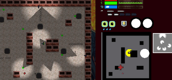
So I’ve made a few changes to the look of EEI.
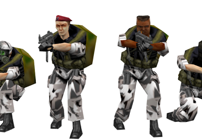
It’s no secret that I’ve struggled to create good art for the game. My forays into AI generated images, while funny, were almost entirely unproductive. I did have a bit of luck working with real artists, but nothing really solidified. With the exception of scouring the internet for a few placeholder assets, there’s not much I can do to improve that part of the game. Which is a shame, because working on a game that looks this bad this long into development can be somewhat demoralizing. It’s also kind of embarrassing when showing others.
Luckily, a little bit of graphics programming goes a long way. Every game benefits from some form of lighting, so what does that mean for Escape From Epstein Island?
Shadow Technique 1: Texture Shadows
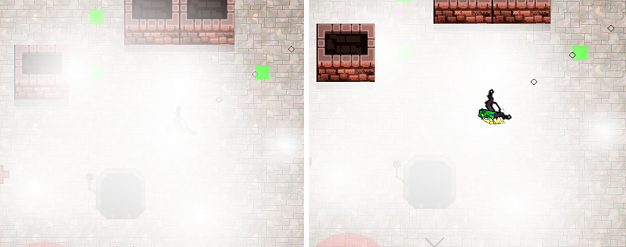
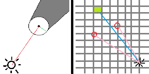
Texture shadows, sometimes called cheat shadows, are common to isometric games and early 3D games. These are created by placing a translucent texture at the feet of the character. Sometimes the character model is used to create the shadow, sometimes a simple circle is placed under the character’s feet. 3D games largely abandoned these for shadow maps in the mid aughts, but they can still look quite nice, and the performance cost is negligible.
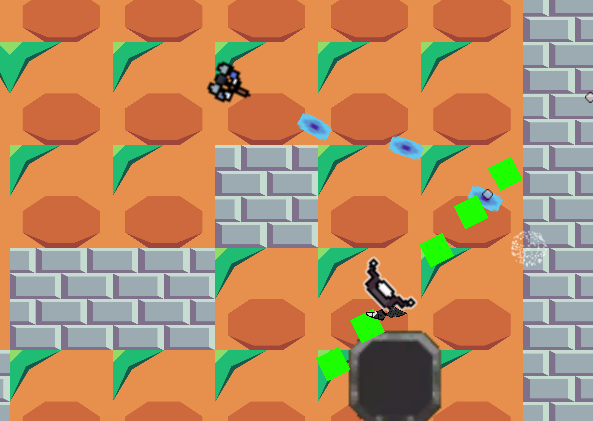
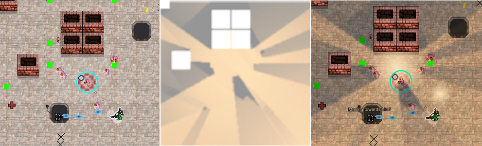
The isometric 2D game on the left is using the sprite of the model for the shadow, rotated and placed at the correct spot.
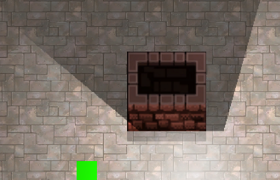
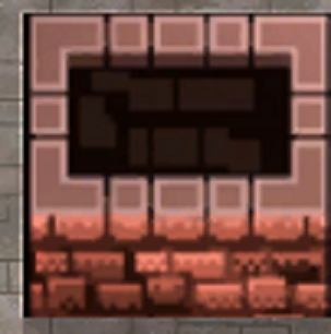
I was a bit skeptical that such a technique would work in a true top down game, as there is no obvious choice for light directionality, and the side profile information doesn’t exist. Unfortunately, the effect is indeed underwhelming.
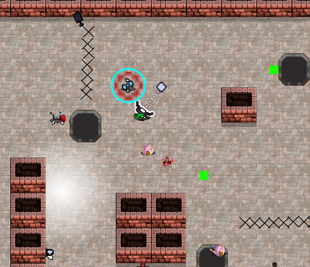
We’ll get to that ball of light bottom-left in a second.
A circular shadow texture just looks like a weird outline of the character. An ellipse also looks weird, as there is no reasonable direction for it to cast away from. I’m going to revisit a modified version of shadow textures as a possible form of ambient occlusion, but the effect is disabled for now.
I think a gradient would look a lot better, and am working on that.
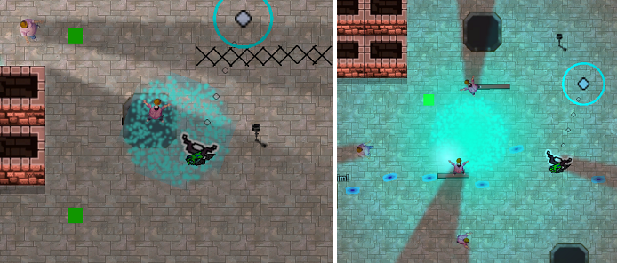
Lighting Technique 1: Translucent Light Sprites
Lights make things brighter, therefore it stands to reason that we can represent light with a translucent sprite rendered over the scene with the correct “size” and location. The falloff can be simulated through a simple shader that lowers the transparency linearly as we increase our distance from the center. Technically it should be the square of the distance, but linear just looks better.
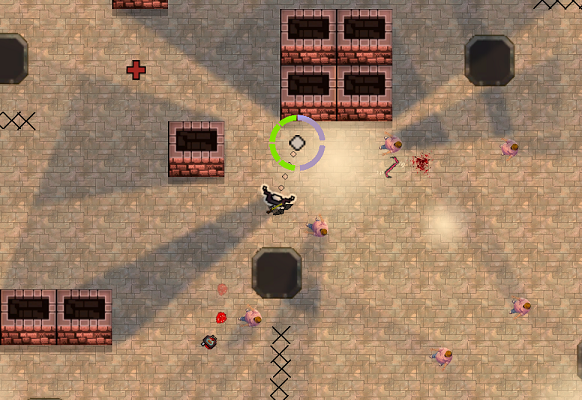
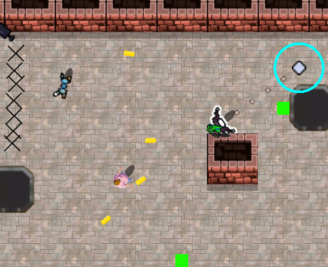
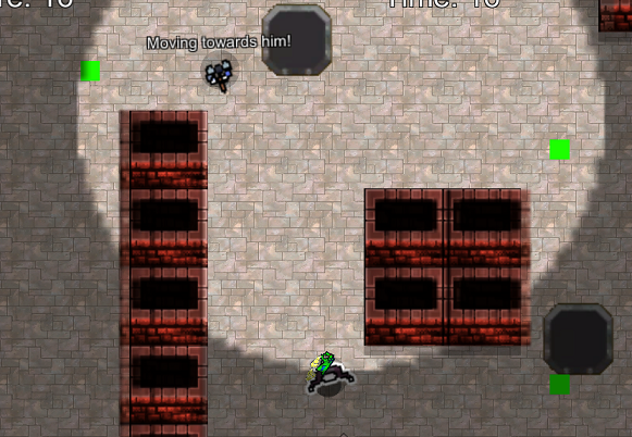
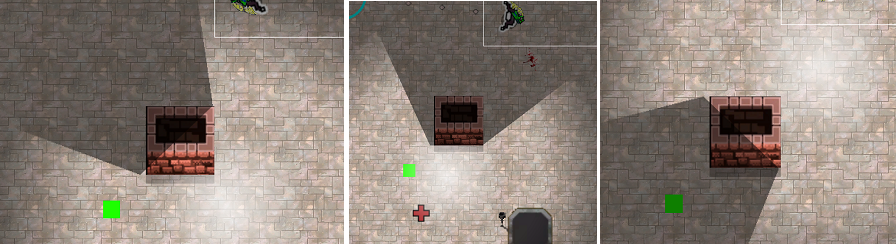
The technique is limited, but for certain effects, such as the warning light attached to the explosive dart below, it gets the job done.
For the pedants, yes I am aware that there’s no such thing as the “size” of a light, when we are talking about its effect on the surroundings. At any distance, some percent of the photons emitted from any light will make their way to the observer, which is why you can see distant stars despite them being incredibly far away. However, for practical terms we can make any additive light a certain size, as the falloff over a larger distance will make it irrelevant.
A more real issue is the limited display capabilities of a computer monitor, which can only display a tiny range of light values at any one time. As a result, weak sprite-lights look terrible, and overlapping strong lights will almost always oversaturate our image. This will either, depending on the order of rendering, completely cover up certain elements in the scene, or give those elements a weird, artificial look as they are obviously not interacting with the lights.
Also, coloured lights tend to be a questionable choice no matter how effective the lighting system, but they look particularly awful with this implementation.
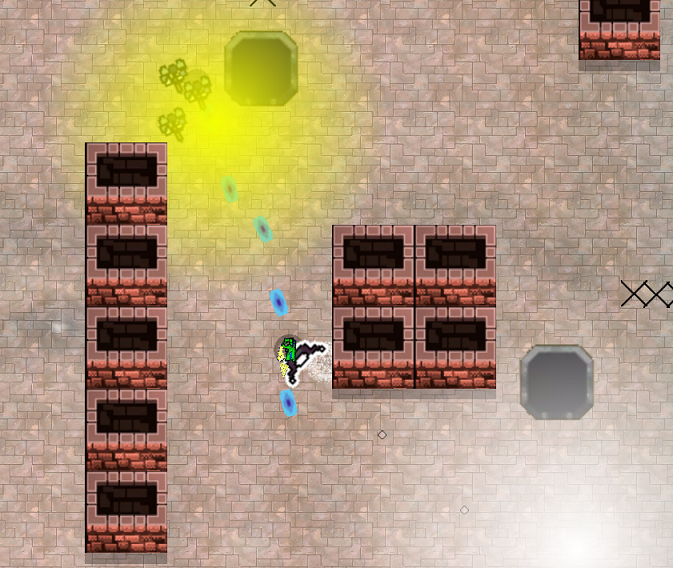
Darkening the scene makes these lights look even worse.
It’s also difficult to calculate shadows with this kind of lighting, which prompted the search for something else.
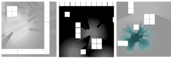
Lighting Technique 2: Screen Space Lightmaps
The basic idea behind screen space lightmaps is that we first draw the unlit, normal scene to a texture. We then render the lightmap texture, filling every pixel with a default darkness setting ranging from 0, full black where there are no lights, to 1, fully lit regardless of lights. Then we render the “lights” to the lightmap, which are simply splotches of colour. Finally, we combine the two together with a simple multiplication to get our “lit” scene.
Calling this “lighting” is therefore a bit of a misnomer. This technique, at least right out of the box, can’t actually brighten anything. All it can do is eat away at the darkness we put over the scene, and if the light is at full intensity, all it has achieved is to get us back to where we were before.
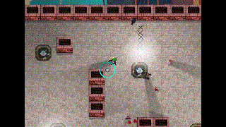
Ignore the weird looking pillars for now, I hadn’t masked the low resolution lightmap over those areas yet.
Our inability to over-brighten the image, or over-dim it with a relatively high light baseline, means that even a random scattering of lights looks aesthetically pleasing. It’s almost impossible for this kind of lighting system to break a game, since it can be tuned ultra conservatively.
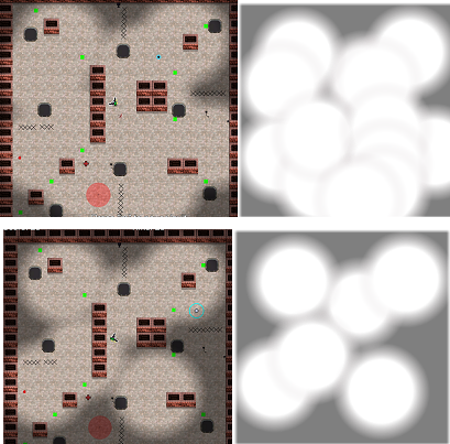
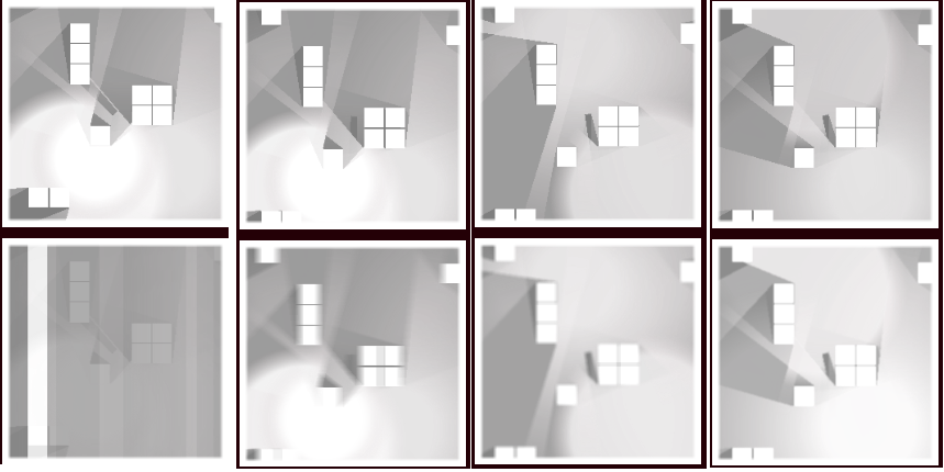
Scenes with their lightmaps.
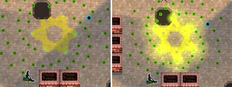
However, since this kind of light can never truly brighten a scene, it does look a touch flat. There are two solutions to this. First, we multiply the lightmap by a value higher than 1. This allows the well lit areas to truly glow, while keeping the purely shadowed areas completely dark. Although we need to tune this conservatively, as the image quickly becomes oversaturated, unreadable garbage.
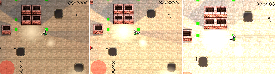
Left, without boosting, middle 1.5x, right 2x. Ignore the shadows for now, this screenshot was taken after the fact.
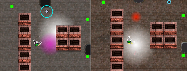
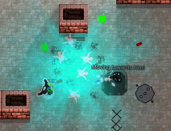
The second solution is to combine our negative, screen space lights, with our positive, sprite lights. This leverages the advantages of both, and creates a lovely simulacrum of real light.
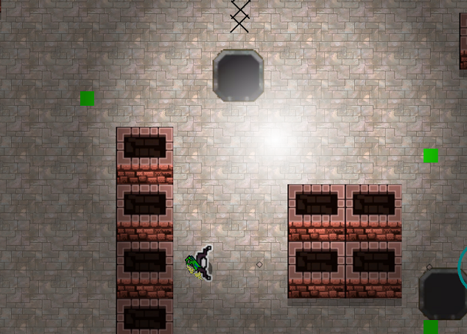
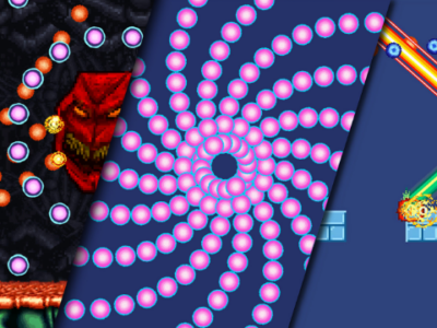
Looks vaguely like a nebula, and I like it.
But of course, we still need to add shadows.
Shadow Technique 2: Point Shadows From Transparency Calculated in Shader
There are a number of differing techniques for creating shadows in a 2D game. Slembke, the author whose tutorial I largely followed for creating the screen space lightmaps, recommends creating a complex, polygonal mask for each light. Instead, I decided to invent my own technique, calculating the shadows in the shader, and transparent’ing out the parts of the light that were therefore in shade.
Example of shadow mask, not used by me.
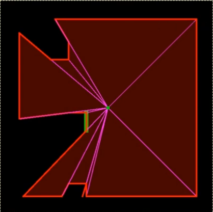
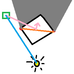
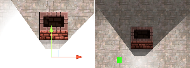
In order to draw shadows from an actor we need to first check if the actor is within the maximum range of the light, which is trivial. Much less trivial is calculating the “edges” of the actor, from the perspective of the light. I made this easier on myself, by simply using the cross product of the vector towards the actor (red), and out of the screen, which produces the green line. Use that green vector, to find the two edges where the shadow starts. This is not perfectly correct for actors very close to the lights, but the error most times is miniscule.
CPU (Above paragraph) -> GPU (Below Paragraph)
This data is passed to the shader, where we also calculate the (blue) line to the uv coordinates representing the (light green) pixel we’re working with. We calculate the (pink) lines from the light to the (red) edge points, and calculate their respective cross products with the blue uv vector. These can’t be shown, as they will either be directly into your monitor’s screen, or directly towards your eyeball. Luckily, all we have to do now is compare the two cross products. If they’re pointing in the same direction, then the pixel is not in shadow.
Teal represents a cross product into the screen, purple represents a cross product out of the screen. They must differ if the pixel is within the shadowed area.
We’re not quite done, as we still need to get the right size and starting distance of the shadows, which took some work.
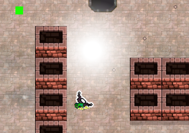
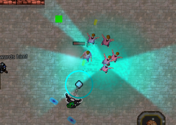
This isn’t really germaine to anything, but have you ever looked at a tree, or cloud, and seen a face? Then, once you saw it, you were unable to unsee it? I can’t unsee the mother pacwoman overlooking a bunch of happy little pacmen children having a chit chat.
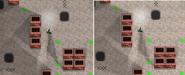
Anyway, that’s great, but comprehensive shadows need to include the pillars.
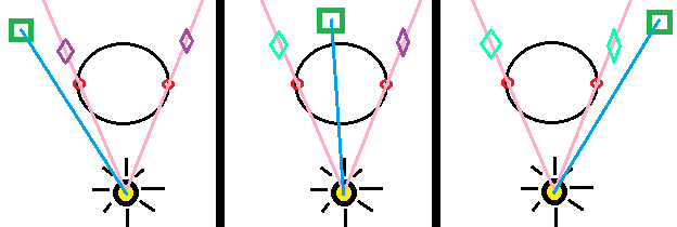
Which is unfortunate, since some of the simplifying hacks we could use on the (roughly) circular actors won’t work anymore. We have to first calculate the two edges (red) that are casting shadows, which we do by calculating the angles/dot products from the light to all four edges as compared to the line straight to the center of the pillar, and taking the largest two. We then create a line (orange) between those two points, and use it to calculate the cross product (pink) between it and a line directly into the screen. Or the opposite, which needs to be checked, and multiplied by -1. Then we calculate a line from either of the two points towards the green pixel, and if the dot product is positive, then it’s further away from the line than the line is to the light. And of course, we do the same cross product checks that we did earlier, to make sure the pixel is in between the two edges, which the pixel in the diagram below is not.
If this sounds confusing, just think how I felt.
And then fix our bizarrely misbehaving shadows.
This was such a strange bug. The coloured segments are from me trying to debug it.
I stand by my decision to do this all in the shader without shadow masks. Having said that, debugging shaders is extremely difficult, as it’s quite a process testing the intermediate stages of a shader. You have to use all these weird proxies that end up as colours and hope you’re narrowing in on the solution.
This wasn’t helped by a totally unrelated problem with the pillars. The shadows were almost correct, but didn’t quite match up with the pillar edges.
Even more obnoxiously, they were lined up perfectly in the editor. It was only when rendering properly that they got bizarrely shifted.
To make a long story short, it was some Unity settings with the viewport rect of the camera that were slightly off. Basically, since the camera renders to a square section of the screen the “width” of the camera was previously given as 0.5625, because that’s the product of 1080/1920. It had to be changed to 0.53333, as the lightmap is 1024×1024, which meant that the two didn’t line up properly. This was actually a problem with the actors, but I didn’t notice it until I worked with the pillars, as errors in precision are much more obvious then.
Even after fixing this I would still get tiny errors around the edges of pillars. I solved this problem just by moving the markers for the edges of the pillars inwards by a hair. This technically keeps the error, but makes it irrelevant, since a slightly darkened edge of a pillar is unnoticeable.
Pillar, pre fudging.
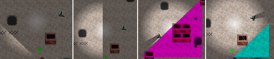
One last improvement I wanted to make to the lightmap was to add a blur. Below is a series of screencaps showing this work. The top row is the raw lightmap. The bottom row is a series of applied blurs.
From left to right: bugged, horizontal blur, 5×5 box blur, 3×3 box blur.
The point of the blur is twofold. First, we get rid of the natural pixelation that results from the lightmap being 1/16th the screen resolution. Second, we somewhat soften the edges, which makes the shadows more realistic, as most shadows in real life are not extremely harsh.
Here’s another comparison with a bit more blur. This technique can’t truly simulate penumbras, but good enough is good enough.
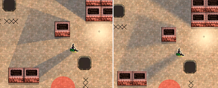
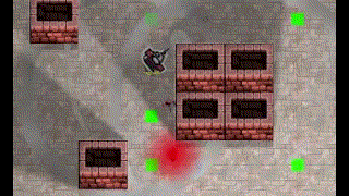
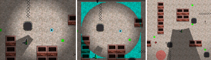
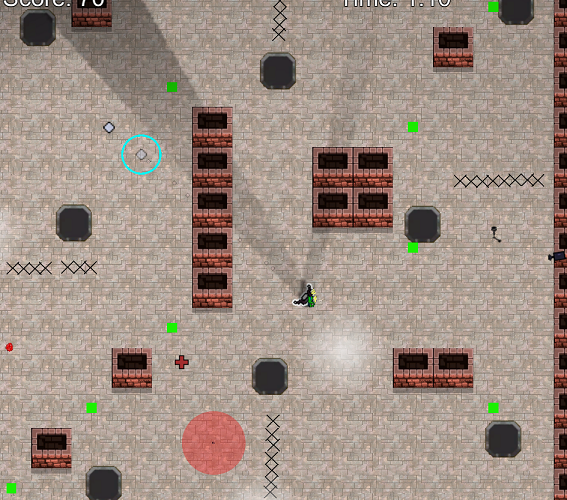
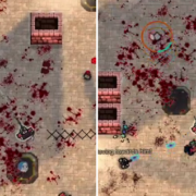
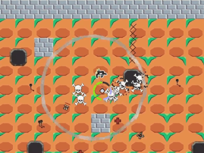
Putting it all together, here’s a comparison of the scene with and without lighting. Please ignore the green debugging squares.
The colours, intensities, placements, and other details of the lights are subject to change. This is essentially the roughest of rough drafts when it comes to lighting on the level editing side. My point is that I spent a few minutes slapping some lights into the scene and the game looks incomparably better.
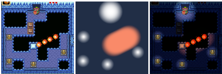
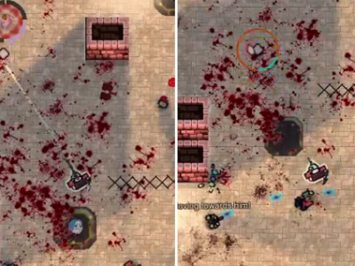
I am only just exploring the newfound possibilities of proper lighting. For example, above we see the old, unlit holy water grenade compared to the new, and below we see the same for the star projectile boss spell.
These effects are themselves not without problems. For example, if the enemies were right in the center of the holy water grenade spill, they would cause very weird shadowing. Which is quite bad, since they are very often right there in the center.
Still, this was solved fairly quickly through placing more, dimmer lights around the effect, and making the main light not cast shadows. I anticipate these issues will go away as I familiarize myself with the system.
 Further experimentation is needed.
In the meantime, enjoy this abstract art.


The art update is a big leap. Looks like it’s really starting to come together. Have you ever used those picture to pixel websites? You could turn a crude mspaint sketch or photograph into something that looks like part of a video game with minimal artistic skill
Can’t say I have. I’ll give it a shot.
Not particularly relevant to the game design stuff, but it’s AI related, and mirrors your experience, so . . . .
Somebody poasted an unattributed text image on poast, and I tried to track down the source using AI.
Asked Google’s AI where this sample sentence from the image came from:
“And Perel, to her credit, essentially admits this without quite stating it directly.”
— first told it’s from 2017 book review in The New Yorker titled “The Meaning of an Affair,” written by Alexandra Schwartz
— This article does not appear to actually exist. AI wins again, right.
— The articles from this author which do exist, do not contain this quote.
— The next day, I asked Google AI again, and it gave me a different article title, different author, as the source.
— I asked for a link to the article, and it repeatedly failed to provide a link while repeatedly lying to me about providing a link.
— This second article also does not exist. It made it up. Again.
Apart from keeping poast’s WaifuPoaster in AI generated anime chick-pics to poast, as far as I can tell AI has no real applications for anything even remotely serious. It’s nothing but a massive waste of time and resources.
Anyway, I’m happy you are making progress on the game. It looks better every time you post an update.
Thank you for the kind words. And yes, I’ve sometimes called it the Electronic Idiot for that very reason. For a narrow set of problems, it can work pretty well, and it often succeeds at churning out slop – I have already created a few (mediocre) SUNA AI songs to be played in the game – but when it fails at a task you can go crazy banging your head into a wall trying to get it to stop bullshitting you and do what you want.
Microsoft has at last managed to make an (occasionally) useful search tool in Outlook (their email client – I have to use it for work), using the power of AI.
Yes, GMail solved this problem 20 years ago with orders of magnitude less computing power, but I guess I can say that ai has made my life better by papering over Microsoft’s general incompetence.