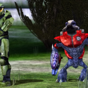

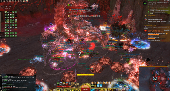
A lot of the inspiration for Escape From Epstein Island comes from First Person Shooters. Many of the enemy behaviours, general level layouts, weapons, and other design elements can be incorporated with very minor tweaks into a top down 2D shooter. Unfortunately, there are a number of unique design problems irrelevant in 3D games.
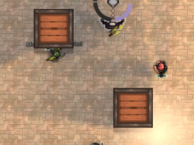
As one of many examples, a player may want to examine something in greater detail. In an FPS, the player just moves closer, and if they can’t, the force that’s stopping them probably leads to an interesting gameplay dynamic. In a 2D game, the player cannot bring the camera closer to anything, as it is always the same simulated distance above the scene.
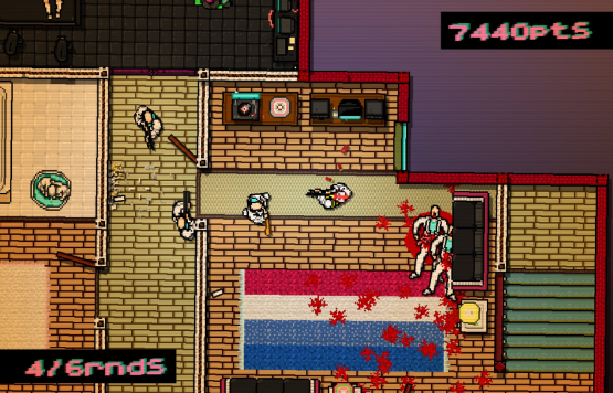
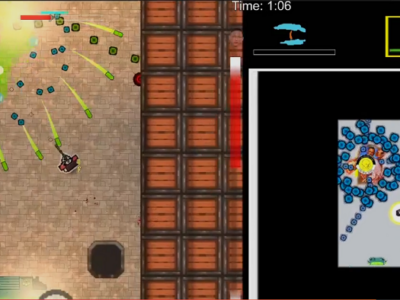
Hotline: Miami. You want to see the guys off screen, but also need precision and clarity dealing with the guys right in front of you.
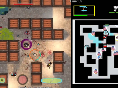
This leads to a bit of a push pull when it comes to the 2D camera. The player wants to be as zoomed out as possible, to view all the macrodetails. Yet they also want the camera as zoomed in as possible, to capture the relevant micro details. They don’t want to get killed by offscreen enemies, but they also don’t want the enemies – and projectiles and explosives – to be so small that they’re visually confusing. This problem can be at least partly solved through the use of a minimap.
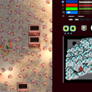
However, the minimap and the combat arena are square, yet the common aspect ratio is 16:9. No matter what the arrangement, there will be extra vertical space somewhere. My original idea was to keep the main arena as free of UI elements as possible, shuttling off the traditional HUD clutter – weapons, health, etcetera – to the unused vertical space on the right side. I have since abandoned this design.
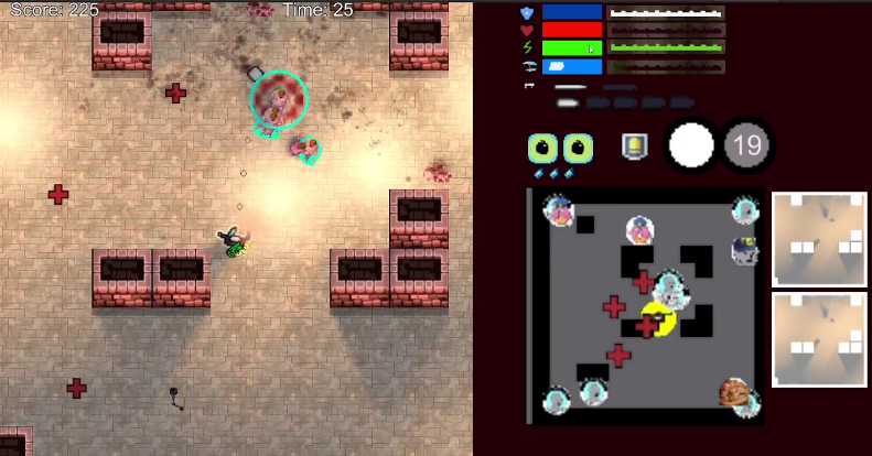
It’s no secret that this looked terrible, but for a long time I assumed it was simply the lack of beautification work, to the point where random debugging items, such as the lightmaps, are mixed in with crucial HUD info. Asking a player to glance at the minimap for a fraction of a second to keep track of an enemy is fair. Although tons of work needs to be put into that to make it more legible, it already works. But the same cannot be said of the HUD elements, which are more important to communicate to the player, yet even more confusing to read than the minimap due to the cluttered mishmash of colours and symbols.
I migrated the HUD to its traditional place. I was worried that it would take up too much of the screen, but it’s amazing how fast you forget its even there when playing. The main issue is that certain elements, such as the sniper, still aren’t clear enough, making it too difficult to keep track of how many rounds are in your guns when things get hectic.
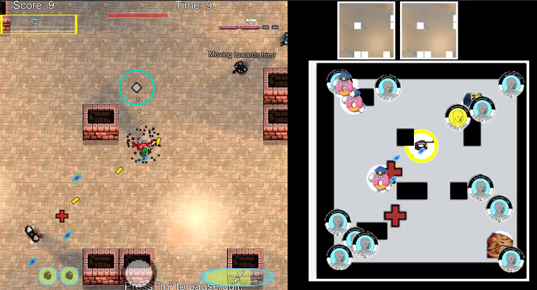
Minimap problems: Finding the FBI agent is like finding Waldo, but it shouldn’t be.
The knock on effect of the HUD migration was to enlarge the minimap, something I wish I’d done earlier. Again, enemies can shoot at the player from off screen, and while all these attacks can be avoided through movement, it’s still unfair to let the enemies do this without showing the player exactly where they are at all times. Enlarging the map, and bumping the resolution up 16x, certainly helps, although a lot more can be done through a more intelligent display of the information.
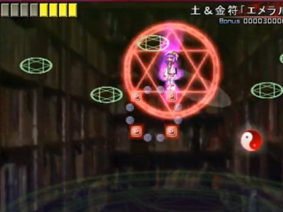
As an aside, I previously had four separate activable effects in the game. The blanks cleared all projectiles, the hardened shield reduced incoming damage by 75%, the radiating shots fired indiscriminately in all directions, and the extra shield was like Lucio’s ult in Overwatch, speaking of a game with a visual clarity problem.
The hardened shield was just cut. It was an idea taken from MOBAs where damage is unavoidable, and it doesn’t fit here. The other three abilities were combined into one (somewhat) get out of jail card on a long cooldown, which removes a lot of visual clutter, frees up controls, and simplifies things the right way.
UPDATE:
At the end of this piece I promised improvements to the minimap, the main issue arising when enemies inevitably overlap. This can be seen in the image below. The FBI agent in the top right is largely hidden by the Predditor and militarized police officer. There is also a Predditor being hidden by the ZOGbot in the top left. The higher the enemy count, the more degraded the minimap’s clarity. In other words, when it’s least useful when you need it most.
Before making any big changes, I standardized the minimap image size to 64×64 pixels. Shaniqua and Jabba the Body Positive Activist were the worst offenders, and have been fixed. Then I took advantage of the much larger minimap to cut the icon size in half. That certainly reduces the problem, although with enough enemies the minimap will become overcrowded.
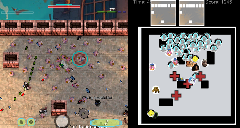
In the future I’ll have to do a few things. First, figure out my graphical layers. I figure the enemies should probably always render over the pillars and health items, which is an easy fix. I’ll also experiment with assigning enemy archetypes unique colours. The hope is that the graphic is clear enough on its own, but it’s quick and easy to test otherwise.
If overlap is inevitable, I’ll have to get creative with the solution. Maybe I’ll selectively play with transparency, shrink the images in crowded areas, slightly shift the images so they don’t overlap, or selectively hide or clump together certain NPC types, such as the trash mobs. These solutions all have various downsides, in addition to being more effort to implement.
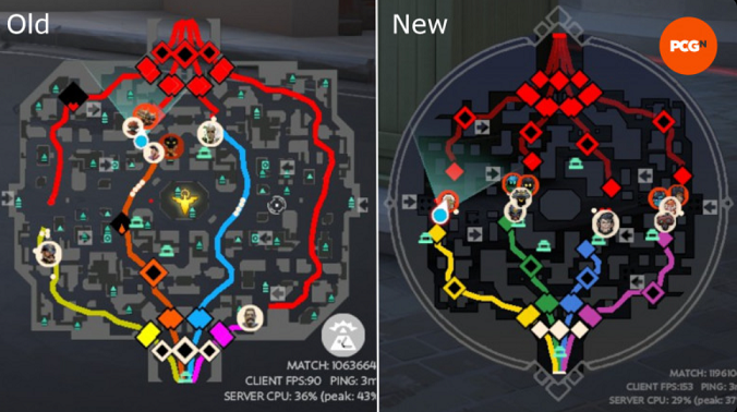
Minimap from Valve’s MOBA
Lots of AAA games have minimaps, so it stands to reason that someone’s figured out the foolproof answer to this issue. To my knowledge, this isn’t the case. Most games don’t have busy enough minimaps to suffer from this problem, and the ones that do tend to just eat it.