
At the end of the last article I mentioned that I was going create enemy sub-classes, and that I hadn’t done this because it will temporarily break the level creation and enemy spawning system. It slipped my mind that there was another reason, which is that my meager artistic skills are already stretched to the max with the current placeholder art.
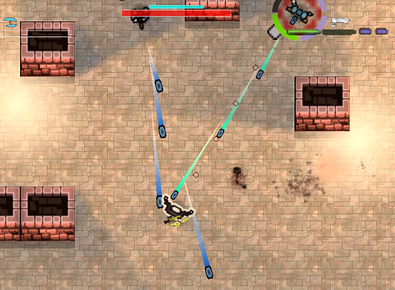
Action games require a certain level of production values, even in development. Audio and video effects don’t just exist to feel good, they transmit crucial information to the player. A missing or poorly implemented effect is not simple jank, but the game being fundamentally broken, and these issues become exponentially pronounced as the game becomes more frenetic.
I’ve slowly fixed a lot of the visual clarity problems, but one has loomed over my head like a Sword of Damocles. The enemies must be instantly recognizable, and must clearly convey their current states. We mostly can’t represent these enemies or sub-states with colours, as the enemy sub-classes are palette swaps. Our only options are creating shapes that are quite distinct, and different sized enemies, but the sizes are constrained by the gameplay.
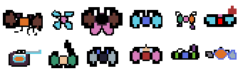
I’m actually kind of proud of this programmer art, but it is awful.
Above we see twelve different idle sprites. At first glance, they are all clearly identifiable. However, two of them are palette swaps, and many more are so close that they might as well be. While they do visually contrast against each other, it’s the colour differences that are doing a lot of heavy work. We can see when we look at a desaturated version of the above image. Imagine trying to quickly figure out who’s attacking you when this is your only information, and there are projectiles, particles, and explosions on the screen.
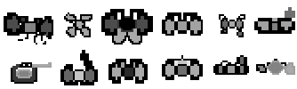
There are a lot of things that make art good, most of which are beyond my understanding, and much of which is up for debate. However, all art, especially in games, must be quickly legible. Ideally, we’d be able to recognize our enemies through a brief glance at their silhouettes.
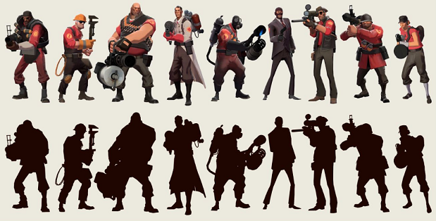
Obviously, it would be absurd to expect myself to produce artwork on the same level as Valve. The problem is that I can barely create anything functional, and what little I can make is done through an incredibly tedious and time consuming process. Doubly so if we want animations.
As of now, each enemy – except the Predditor who was made by an artist I know – have one frame animations representing their states. While not a huge deal, placeholder animations would allow me to ensure the animation programming was entirely done, ahead of hiring an artist to make real assets.
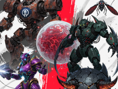
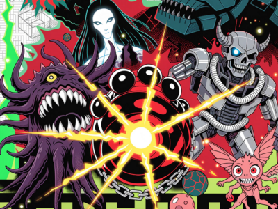
To fix this problem I once again looked to Machine Learning (AI) image generation software. Surely, through a combination of improvements on their end, better prompting, and proper use of reference images, I could wrangle these things into not being so utterly terrible. At the very least, I figured I should be able to generate images that were actually from a top down perspective.
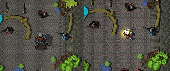
The correct perspective guys are from the reference image.
I definitely had more success than last time, but learning how to work these “AI” tools to generate something even close to approaching what I want is a such a massive timesink that it defeats the purpose. They do not respond to me explicitly telling them what perspective I want, no matter how I try.
To fix this, I naively fed them reference images from Intravenous, Hotline:Miami, and other true top down games in the hopes that they’d get it. Instead, most took that as their cue to blatantly copy the reference images, introduce a few glitches, then plunk their new creation down in the middle with the wrong perspective.
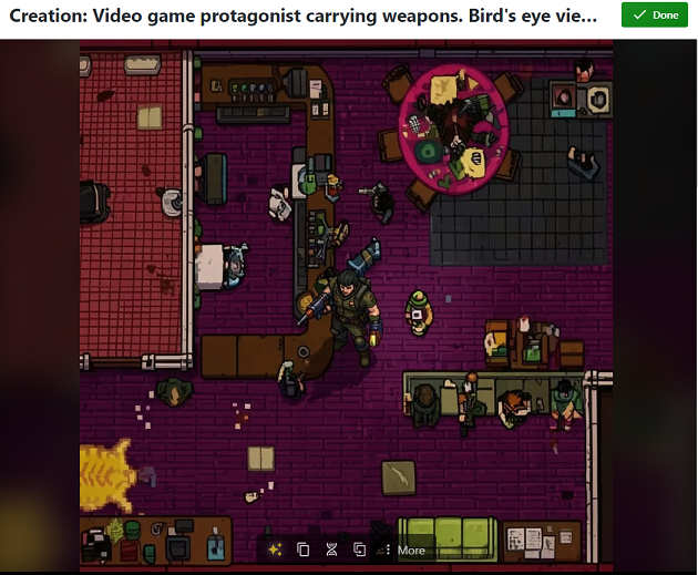
I really wanted to make a good go of it this time, so I changed my reference images to what we see below, and tried again.
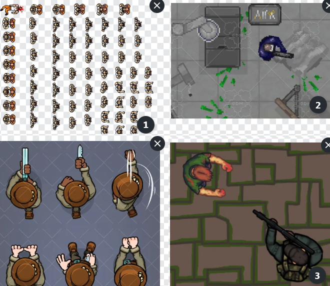
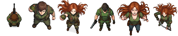
In fairness, the results weren’t complete trash. Nightcafe gave me the series of images you see below. They’re fine, although I should note that they were irregularly sized for no apparent reason, and that only the far left image is usable even as a placeholder. Even then, I’d need to manually create more images representing the various states.
All of these online ML startups are spammy trash, who differentiate themselves in the most bizarre ways. The one below offered to “enhance” my prompt, and the screencap below does not capture even a third of the wall of text it spit out. After doing this, it praised me for prompting it with such specific details. In other words, it praised itself for turning my prompt into a novella.
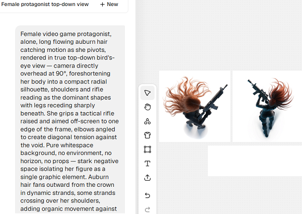
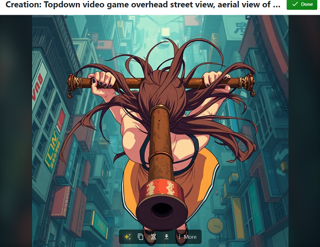
I think this was Recraft.
The resultant image, while aesthetically fine, is useless for a lot of different reasons. I thought it had some potential, so I wrestled with the Electronic Idiot with until my free credits dried up, with nothing to show for it. I tried a few other slop creators, but they were too poor to even document.
Pixel Lab was better, although this particular female video game protagonist it spit out belongs in Silent Hill.
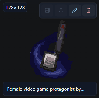
I didn’t prompt it to give me a cube head.
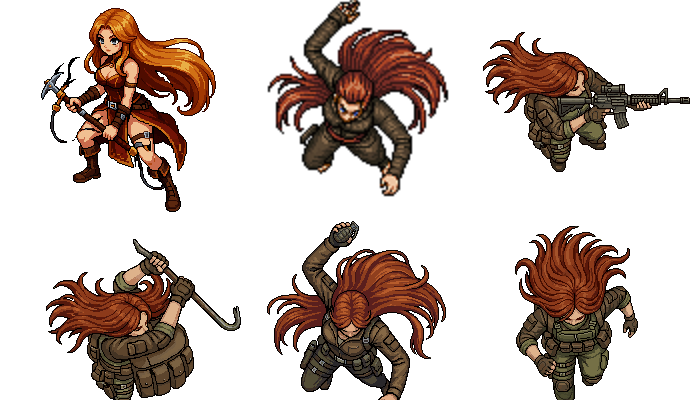
Eventually, it managed to spit out this series of images below, some of which would almost be useful as placeholders. It then informed me that I was out of free credits, and demanded payment. This was not something I felt particularly inclined to do, not just because they proudly advertised denying service to Russia, Belarus, Iran, and Venezuela, but because the product just wasn’t worth paying for.
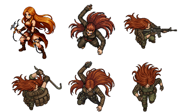
What is going on bottom left?
The value proposition of these sites was supposed to be that they create rough approximations of the intended result, and in that respect, they repeatedly fail. I’m sure there are plenty of niches where they succeed, but top down images aren’t one of them. At least they’re not doing this anymore.
Plan B is for me to open some editing software, probably Aseprite, and create the next set of placeholders myself. A lot of work can be done with geometric shapes, squished heads, triangle faces, spikes on the shoulders, etcetera and since it doesn’t need to look good, just legible, it theoretically sounds like something I could do. It’s an interesting challenge, but since I’ll never be nearly as good as even a mediocre artist, and time is of the essence, it’s mostly just frustrating.
That leaves us with Plan C, downloading already made assets that are roughly appropriate. The good news is that there is a glut of decent quality 2D assets that can serve in their place in the meantime. The bad news is that I’ll still need to crack open Aseprite and manually edit a lot of these sprites, but I can live with that. Worst case scenario I use the images as high quality references for simplified designs.
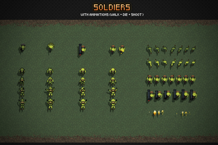
Pack I bought for $1.20. Other assets included.
Which leaves me with unbreaking all the programming related to spawning enemies, and creating the levels.